doubledouble.be NEW WEBSITE
A single identity for a double competency
Our expertise
- Wordpress development,
- Branding,
- Storytelling,
- User Experience,
- Design
DoubleDouble’s name already says something about its dual skills in film and motion design. How can we find a clear, impactful way to enhance both competencies while keeping them together in a single identity?
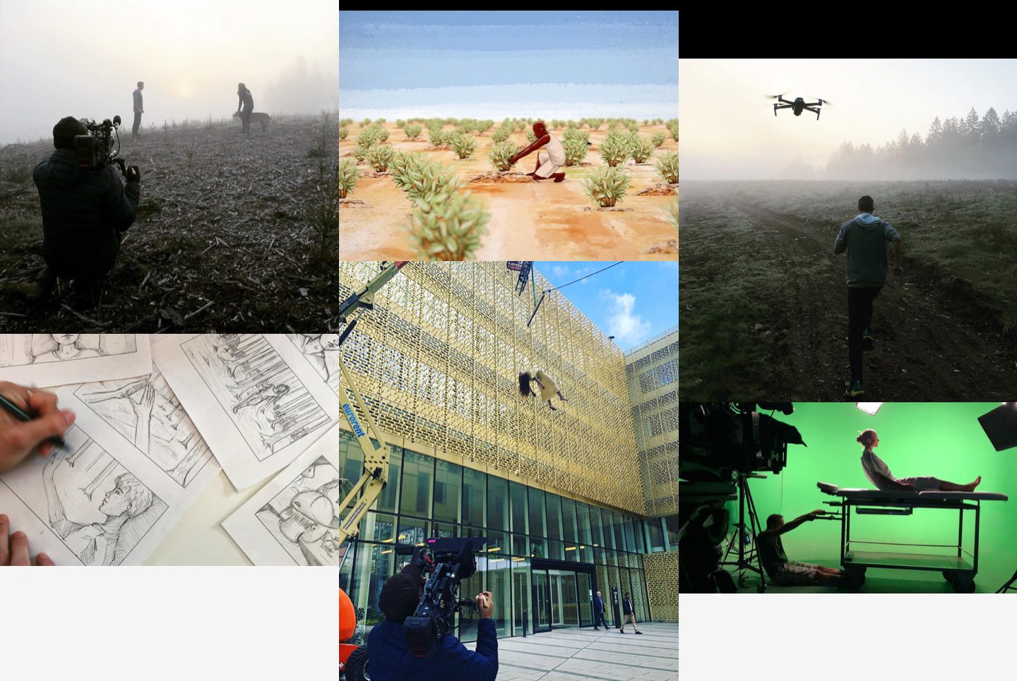
01 The story
DoubleDouble produces commercials, branded content, 2D and 3D motion design.
Our team and the one at DoubleDouble are literally just a street away from each other. This proximity is not just geographic, it’s also tangible in our work - we often collaborate and proudly present each other as our “sister company”.
DoubleDouble has never ceased to improve the quality of its productions since its creation back in 2009. The assessment was quite clear: their website didn’t fit their evolution and they needed a new graphic universe to support and match their new ambition. Quite naturally, they addressed our team to take up this challenge.

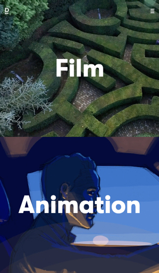
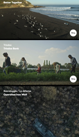
02 A connecting-separating homepage
DoubleDouble's entire visual identity is based on this central issue. How can we express through a unique logotype, a single website, the dual competencies of the production studio: film and animation. The site's homepage solves this connection-separation with a horizontal split of the screen. The screen is "duplicated", conveying equality between the two areas of expertise and also echoing the logo.
Duplicating without mixing
The very structure of the site offers two distinct spaces for both activities. Of course, it sometimes happens that the two specialties come together on particular projects. But this is still an exceptional occurrence.

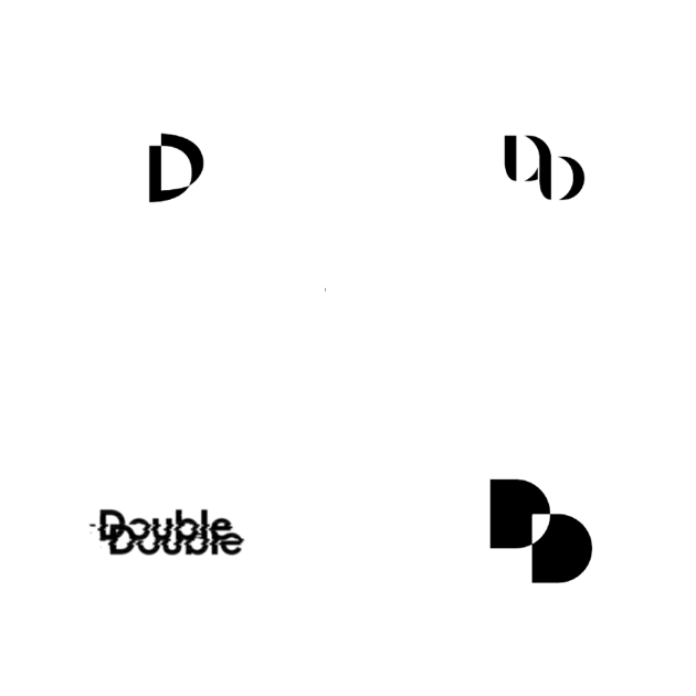
03 The logotype
There’s no need to repeat "Double" to say "DoubleDouble". The logo suggests repetition by showing part of the second "Double". The reader’s eye will then naturally ‘rebuild’ the second "Double" from the one they already know. An economy of means to reinforce the singularity of the sign.
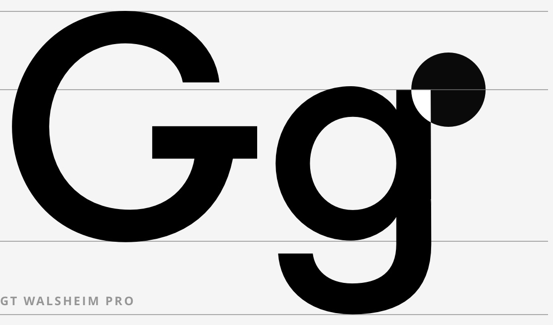
Working with a brutalist typography
We chose a strong bias for the typographical treatment - minimal text in the boxes to get straight to the point.
This brutalist side gives a bold appearance and a powerful stature in positioning. Highly contrasted use of large type adds character to animated images and reinforces DoubleDouble's character.
04 Ensuring the fluidity of the experience
Development work: preserve the video rendering quality for a smooth HD experience; it took a lot of optimisations to ensure that.
The cursor: when it passes over something, it guides you in what you can do to make the experience even more fluid. A small loading animation of “DD”: a fun little touch for any waiting time.
Giving the mobile version
some extra care
With ever increasing use of mobile phones, a special effort has been made to provide the same split screen experience on the mobile homepage.

Lorena Foucher Creative Director