The New Walking Men Logo
The fascinating tale of an elegant rebranding
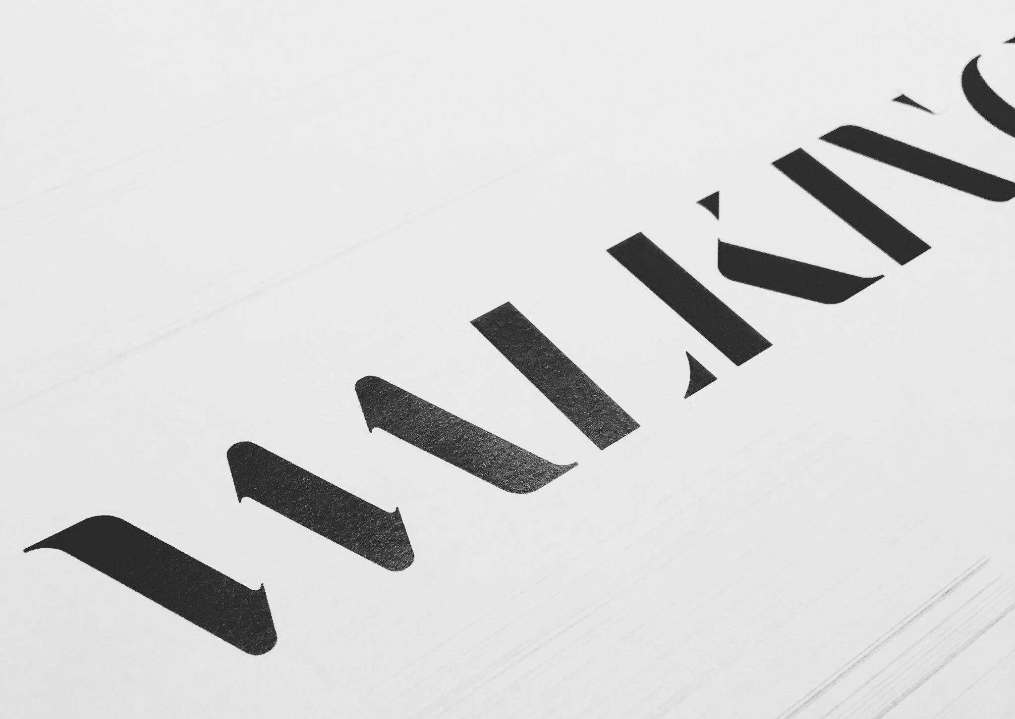

Preface
Founded in 2001, Walking Men is a well known and respected Belgian digital creation agency — be sure to check out our new website, by the way;) ! It’s also a tight team (of 15 people, give or take), an intimate relationship with clients, a certain taste for beautiful, well-crafted things, from all disciplines alike. Experts in digital strategy, we’re ambitious when it comes to the visual quality of current projects as well as those to come.
This year, the introduction of new faces and talents to our team naturally led us to reflect on our overall position as an agency amidst a complex and competitive digital playing field. The necessity to completely renew our visual identity to reflect this new team was undeniable.
...
The beginning
In November 2016, I had the opportunity to participate in a Masterclass, led by Stefan Sagmeister (for whom my admiration knows no limits), during the Kikk Festival. That day, Stefan S. gave us a quick demonstration for a method, which, when starting a new project, opens up the potential to dare to think differently (that famous creative process). Basically, to find a new way of resolving a problem of communication.
The main task was as follows:
Your project consists of creating the new logo for a bank. Let’s take the Bank of Belgium, for example.
Here’s the constraint he placed on us:
Observe the space around you: chose a detail, develop your research and suggest one or more logos based around this element.
While the proposals for logos we created in the span of an hour or two may not have been revolutionary, the research that went into them was well worth the unexpected journey to get there.
But I digress.
...
Walking up and down stairs: crazy, I know
Walking Men, is first and foremost a big, lofty space — atypical architecturally speaking and renovated with great care by its founders. Because it left me feeling anything but indifferent, I began to photograph it.
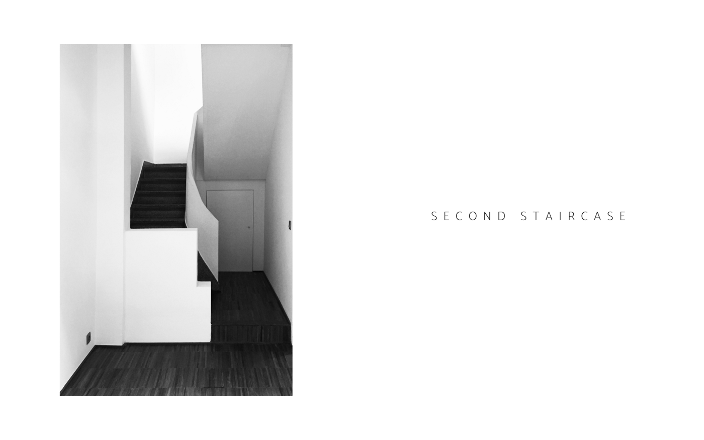
I then traced the strong lines that defined the structure of the space, not yet knowing what direction this project was going to take.
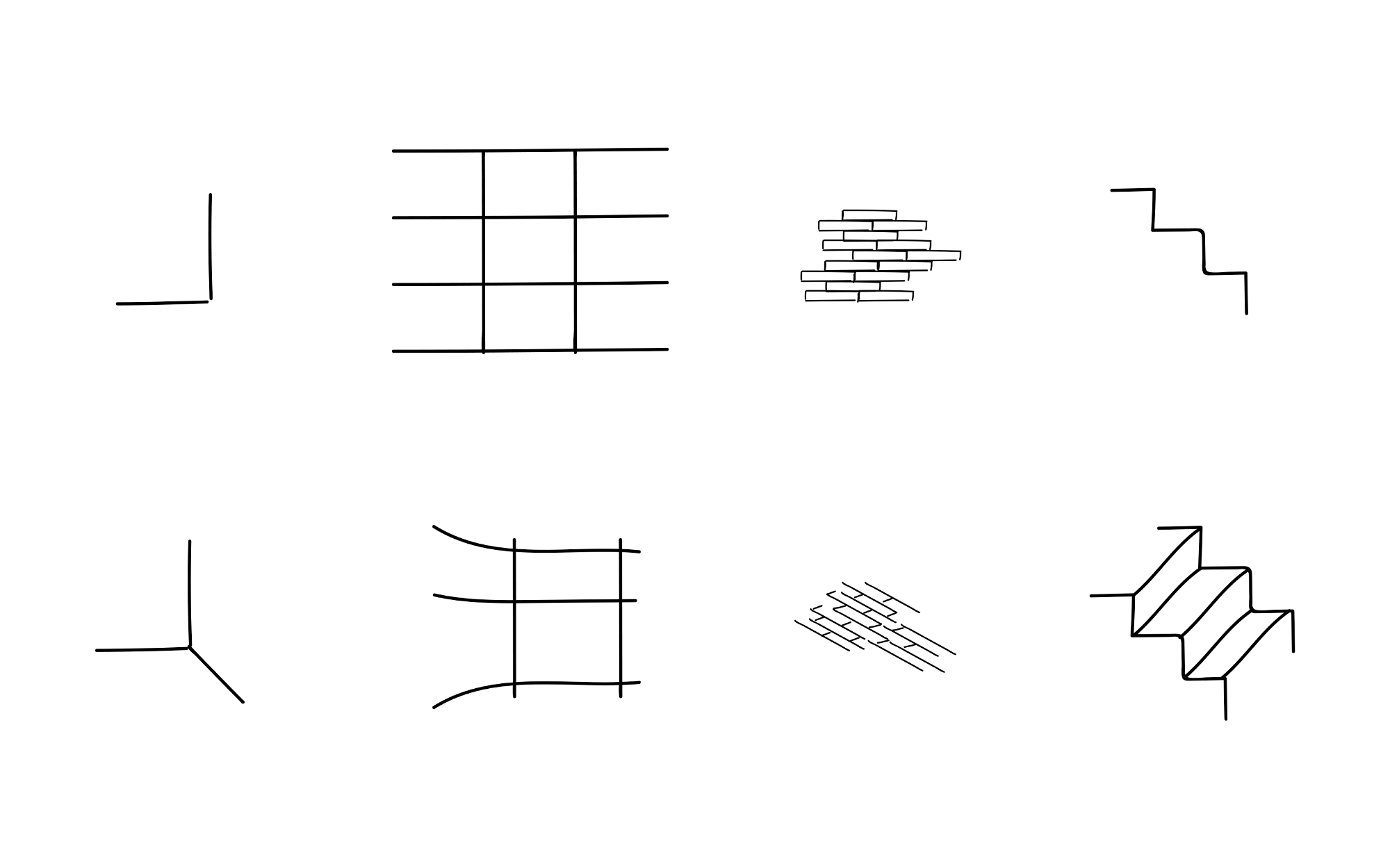 Absolutely amazing freehand sketches.
A small team in a big space is a luxury, and it’s also an obligation to make us move around to work better together. Between us lay two staircases, connecting:
- The ground floor, where the reception desk as well as strategy, user design and artistic direction offices are located
- To the first floor, dedicated to project management as well as front- and back-end development.
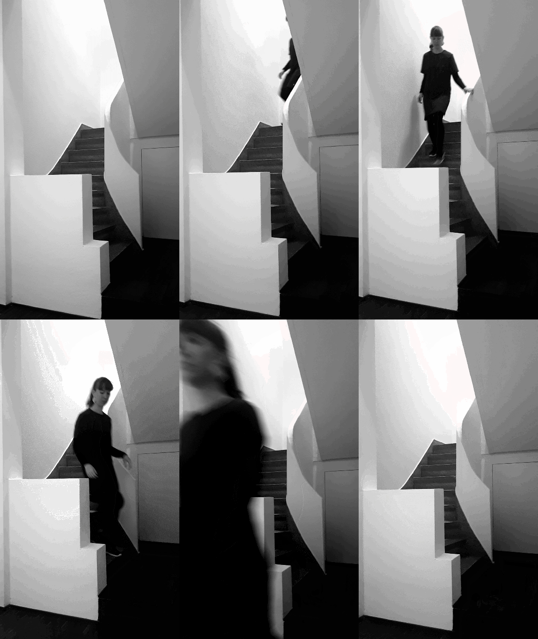 Creative subject making her way to her desk with gusto.
And then comes that moment when you become quite obsessed with stairs and go all out on your sketchbook.
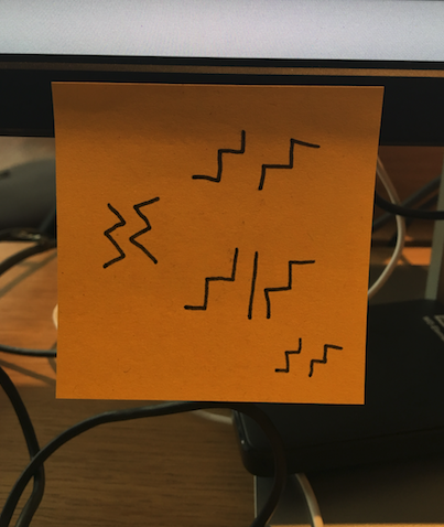 But sometimes, a post-it does the trick.
Collecting images
Below are the three moodboards that continuously fed our research.
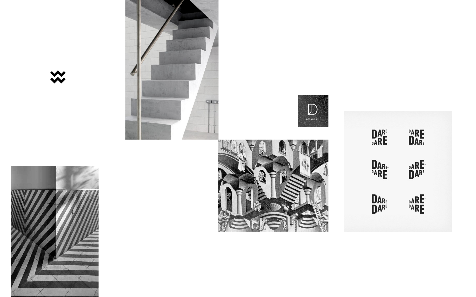 Rhythm & Contrast
...
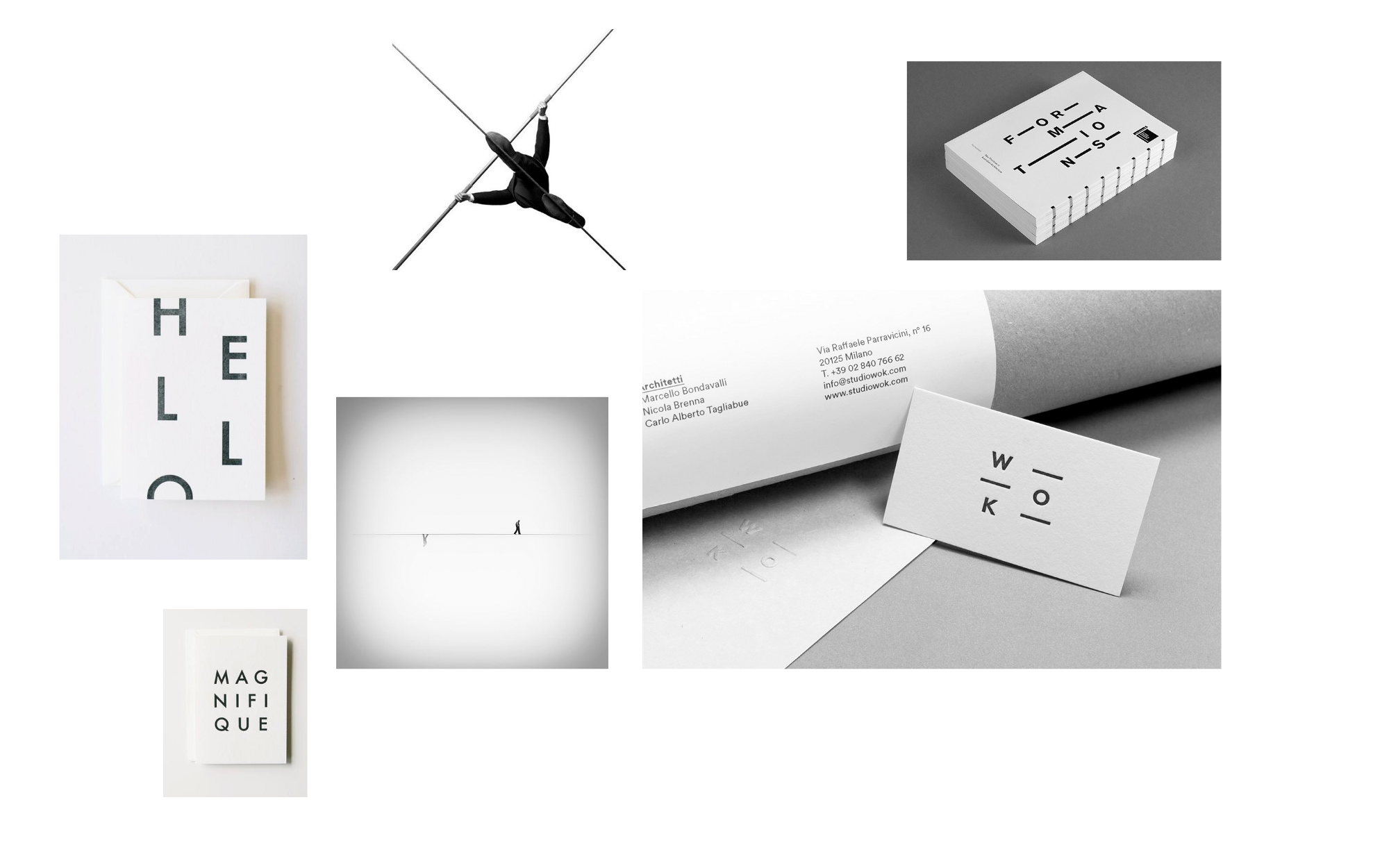 Balance & Tension
...
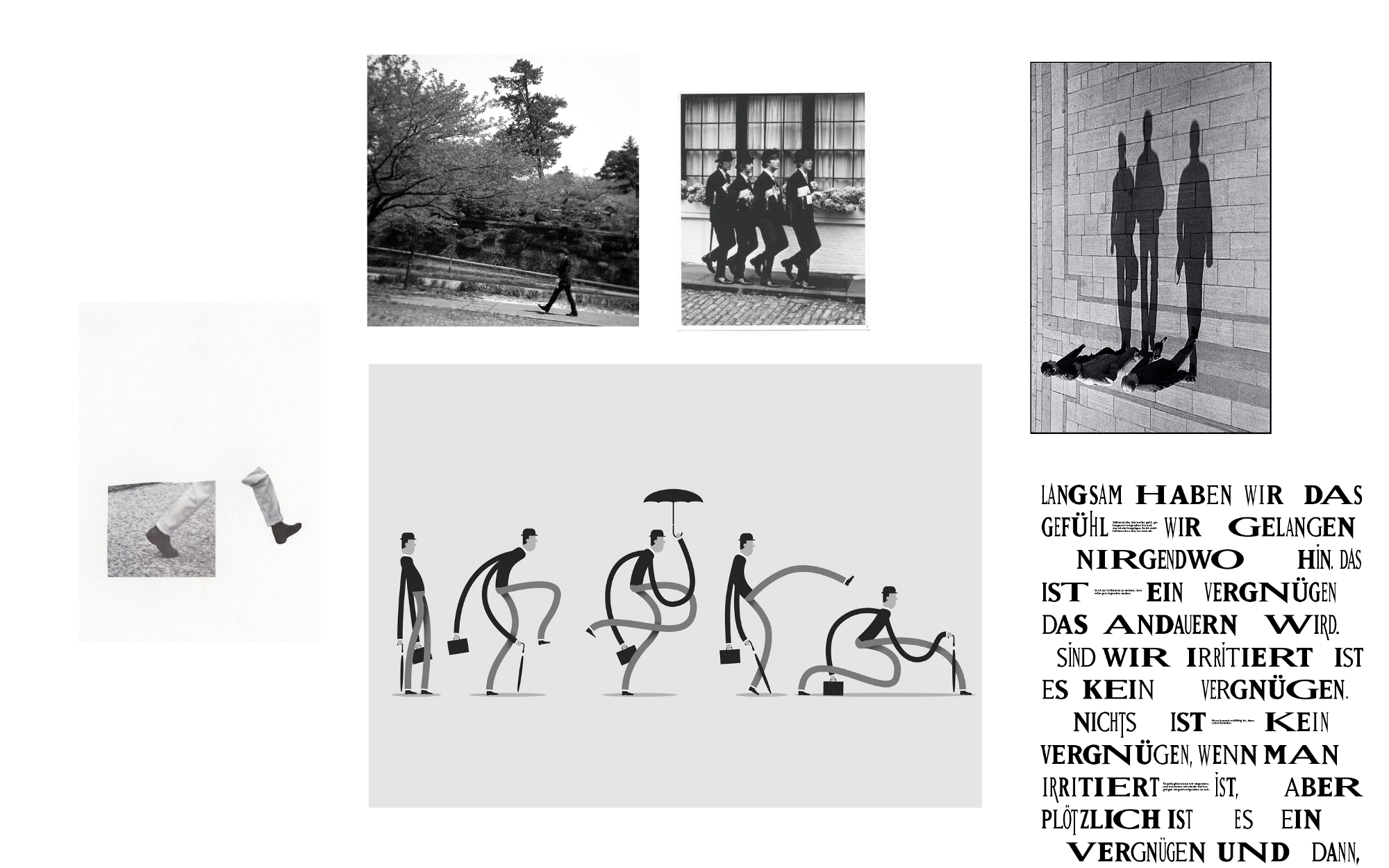 Walking & Moving
...
Look, walk and then look again.
It was the initials of Walking Men — WM — that lay at the origins of the logo. Why? Undoubtedly because the words “Walking Men” are very large elements when it comes to creating a logo. So for me, it seemed simpler to first focus on “WM”, inherently more graphic.
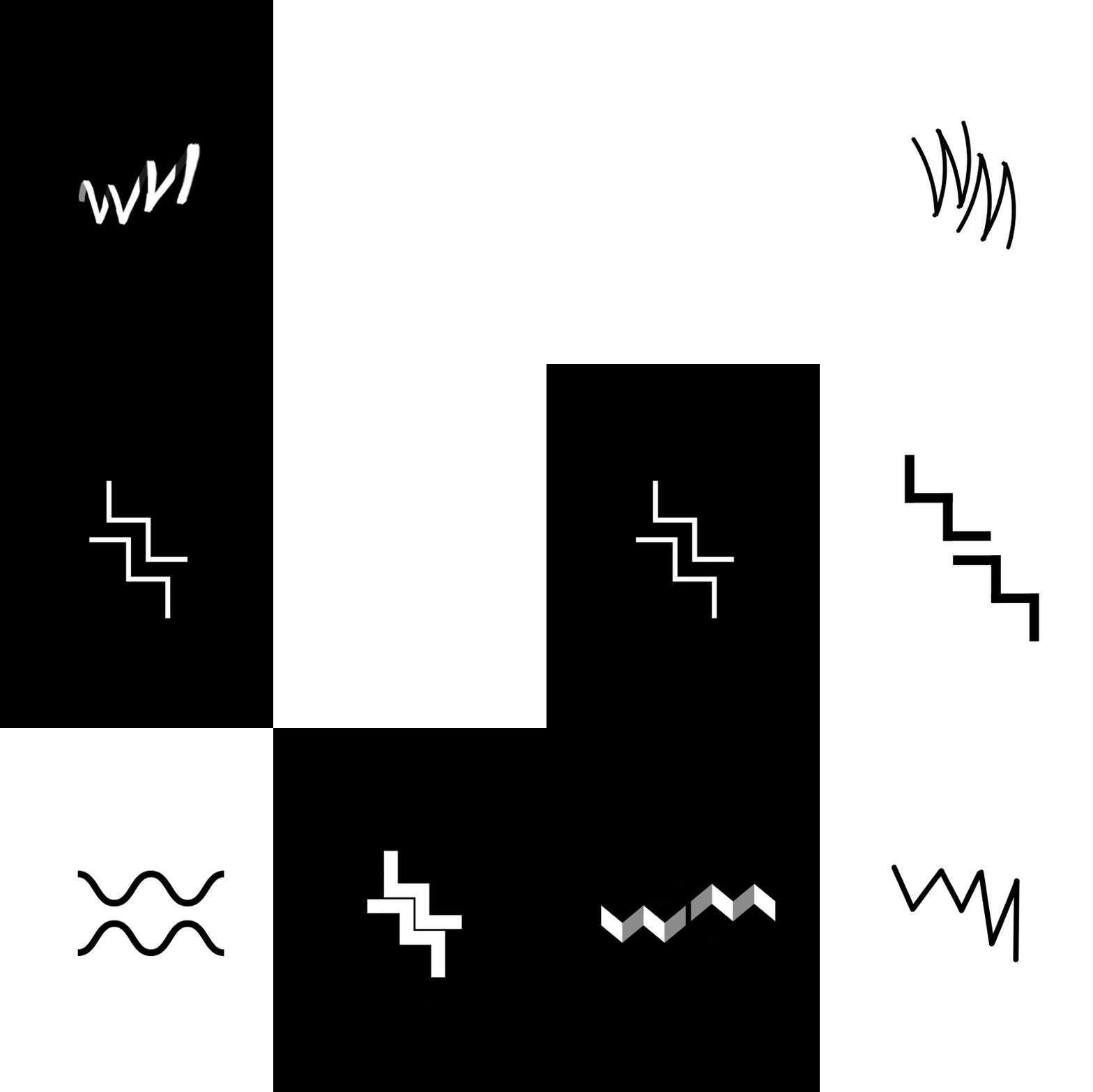 Research gone wild.
...
Here are the 3 proposals that sum up the different researches:
 Proposal 1
Make the link from top to bottom:
(+) Creates a connection between the two terms Walking and Men
(+) The verticality of the anagram mirrors the architecture of the office
( - ) Lacks impact and vigor, delicate.
 Proposal 2
An almost identical system:
(+) A game of lettering that evoques movement
(+) An identity that we assume to be adjustable
( - ) As to the overall balance, well we’ll come back to that…
 Proposal 3
This presents a more contemporary version of the the current logo.
(+) Links between the [WA] and [ME] / a play on contrast and perception
(+) Elegant, sophisticated, efficient
( - ) But a little deja vu nevertheless…
...
Going one step further
 Above: Playing around with the weight of [W] and [M]
Almost there, but let’s keep walking
The rest was then passed onto Michele Cinquino (UX/UI Designer @walkingmen, illustrator, avid letterer and typographer), tasked with the mission of finalising the new symbol and developing the final logo.
How do you infuse these fused letters with the movement so necessary for working as a team, and how do you represent the truly complementary nature of our agency?
 Explorations around shapes and curves from simple sheets
Michele created a monogram, taking on the charming name of ambigram, which would become the main pattern for Walking Men:
The curves, the playful tension between thick strokes and lighter, thinner lines, the conjonctions becoming increasingly fine in order to mark the invisible link between the different parts. Positioned vertically, they evoque the stairs of the agency’s office. Their mirrored construction and the dual reading of the capitals suggest the close collaboration between Walkers.

It’s all a matter of perception.
After several attempts that we can sum up with:
And here, do you still read Walking Men or not?
The definitive characters draw themselves through a mixture of straight and curved lines artfully adjusted and carefully cut so as to keep only what’s essential.
And thus the new identity of Walking Men was born.
 Explorations around shapes and curves from simple sheets
And voilà.