AGC Glass configurator Online Tool
A tool to access the full
potential of glass
Our expertise
- Angular application development,
- Branding,
- Digital strategy,
- User experience,
- Drupal Web development,
- Design,
- Analytics & optimization
We’ve all experienced supposedly time-saving online tools that make no sense and, instead of answering our original question, only leave us with frustration and confusion. It’s no wonder it gets so complicated if a configurator has a near-infinite number of combinations. But the number of parameters shouldn’t be seen as an obstacle - on the contrary! It’s our job to embrace all these possibilities and transform them into a thoughtful, smooth, intuitive platform.
01 The story
AGC Glass Europe is an international glass manufacturing group based in Belgium. They are one of our most long-lasting clients, and we’ve worked with them on several projects.
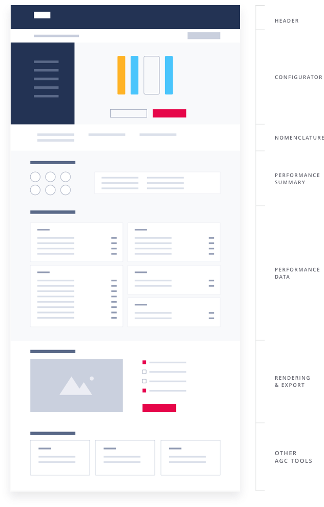
The Glass Configurator is one of many tools developed by AGC to showcase and support their custom products. The setup takes a series of ingredients that the user can combine, applying specific rules and requirements, from a single sheet of glass to quadruple glazing. The configurator then calculates a formula, giving the user a clear view of their product’s technical features and specs. Without this kind of product showcase, architects and developers could easily miss out on the enormous potential of certain glass configurations.
The AGC team got in touch because they wanted to improve their existing system - to make it faster, more user friendly, and more modern.
02 A gigantic
UX project
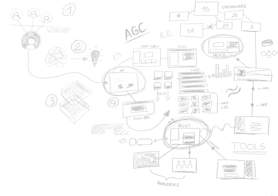
Understanding the business was a significant piece of work in itself. In addition to that, we had to make sure we were integrating all the different stakeholders, understanding their work, and coming together as a team. The workshops were crucial for this.
By starting work on such a significant tool, AGC realised their entire range had to be rethought. Until that moment, everyone saw their own product as unique - but now it was time to bring everything together to meet their shared challenges, creating a thoughtful, synthesised, and organised result.
This first phase brought plenty of different solutions, but no model to compare them to. This was probably the biggest challenge of the project: finding ways to make it easy AND fast to change more than a thousand (yes really) parameters.
A powerful tool easy to use
The challenge in implementing this kind of tool wasto make user decisions as intuitive as possible.
The composition had to be visually clear and the parameters of the different components had to be made with simple and sequenced choices. That way, we made sure the user would feel guided through their experience without being limited and would always have access to the tools they would need: the huge AGC catalogue, the ability to save or share their compositions, the power to create a glass from scratch and more.
The user experience, despite its density, turned out to be satisfying, giving the opportunity to always test more and more different combinations for a better fit.
 Hover
Hover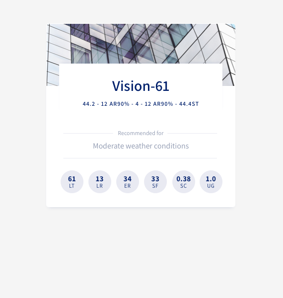 Normal
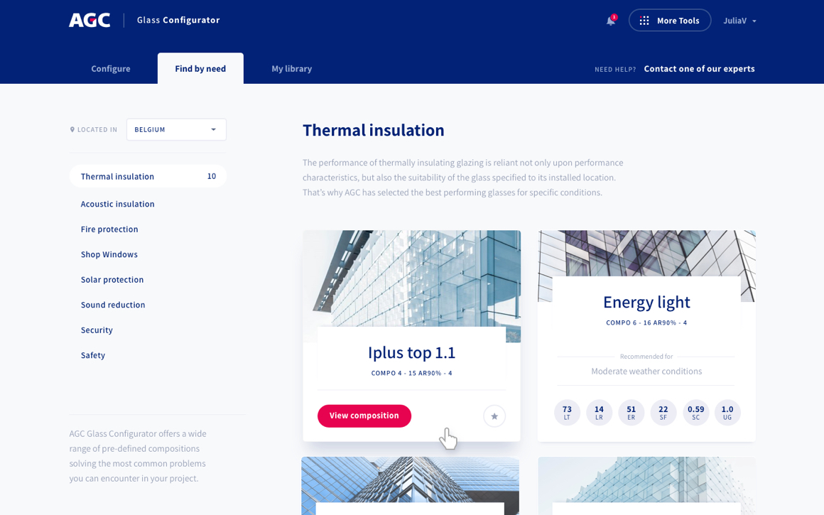
A tool that can also advise
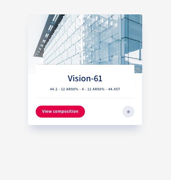
This tool is also a way for AGC to make recommendations. The process has been simplified by allowing AGC to recommend popular products for frequently-used features: for users seeking technical insulation, environmental sustainability, or maximum safety, AGC already have products on hand.
No matter what users’ needs or experience were, the new tool can cater to them. It offers a friendlier experience than ever before, using the combination of pre-set recommendations with clear organisation of all the custom options, supporting users to expand their glass needs.
All of this contributes to the transformation of AGC, who want to make their products more accessible and comprehensible while still offering just as many possibilities.
 Hover
Hover Normal
03 Design in
service of UX
We create a whole new design system and developed new visual guidelines. Design helps making Glass Configurator an intuitive and familiar tool.
We created a coherent yet accessible system that matches both former user and new visitors. This system was designed with particular attention to accessibility standards. The work on the choice of colors as well as the graphic elements helped to build a clear and harmonious tool.
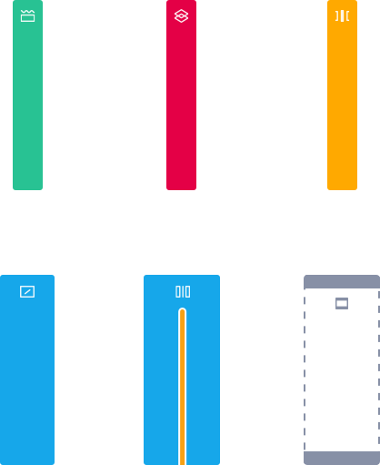
Building a visual system around icons
How can you create recognisable icons for materials as special as interlayers, coating, laminated composites or even a cavity ? How to differentiate them?
These are the questions we were asking from the very beginning of the project. The solution was the result of strong graphical research. Combining AGC conventions with graphics expertise was very exciting. Colours were also carefully chosen to match the codes of the glass sector.

04 Translating it all into a smooth front end
We spent plenty of time going back and forth with the developer on the finer details: animations, transitions, and how to maintain that fluidity.
We also paid special attention to the interactive aspect of the tool; how do we handle the thousands of possible configurations and flag up potential errors? To support users, we developed educational animations to guide them past impossible combinations and towards the solutions they need. This informational support also helps existing users discover the new tool.
Multilingualism
made (almost) easy
This project required a real mastery of Angular, a Google technology used throughout for code, with some Drupal behind to handle the translations. The tool is now available in six languages! The translation work was set up with another agency via Drupal, facilitating a smooth translation as part of the workflow.
