ARCHIPELAGO.BE NEW WEBSITE
Humans and buildings:
a fresh start for a unique architecture company
Our expertise
- Wordpress development,
- Content strategy,
- Copywriting and translations,
- User Experience,
- Design,
- Social Media strategy
Starting something new can be so scary, and yet so stimulating and fascinating. Almost everything, if not literally everything, all of a sudden, seems possible, and boundaries that seemed to be so fixed can be rethought. How can - and how should - design play a role in supporting a transition? Can design affirm a new reality for a story that has already existed for decades but that also is about to change drastically?
01 The story
Archipelago is the result of the fusion of two well-known and respected architecture companies previously named ar-te and baev, located respectively in Leuven (Flanders) and Brussels (Wallonia). In 2019, having started the transition a few years earlier, archipelago became the unique brand behind these two pre-existing companies, bringing together 120 collaborators.
Behind the walls
archipelago is a serious and audacious company managing complex large-scale projects. All archipelago’s projects are driven by the ambition to lead the way and to find solutions that mark a step forward, creating contextual and sustainable architecture.
This made our challenge pretty clear from the very start.
Firstly, building awareness for a brand that is strong and different. But secondly, offering an experience that will make an impression, whether the visitor is familiar with architecture or not.


02 Building the “archipelago brand”
Looking at other architecture websites, we were astonished by the uniformity of most of them. Many - if not most - architecture companies share almost the exact same style of website!
Keeping this in mind, we took a step back to focus on the word ‘archipelago’ itself. As “an extensive group of islands”, an archipelago is naturally deeply related to the idea of a gathering. An idea that makes a lot of sense with the story of the company!
A few graphic elements were already defined but it was our work to complete this base and reveal the archipelago brand. And because a recognisable brand is so much more than a logo, we had to enrich the archipelago visual identity.

03 Telling the difference with a single letter
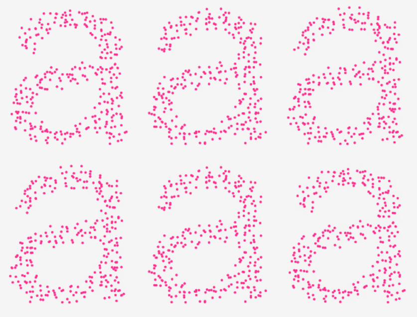
The starting point was a letter: a. Funnily enough, the first one of the alphabet, too! But also the only graphic element that is in the logo and could represent the whole brand by itself. In that way, a letter that embodies the idea of a gathering. From there, we took “a” as the common theme and explored typographic paths to highlight it.
04 Homepage
and revelation
The archipelago brand is revealed in full across the whole website, but the homepage has to play the central role in positioning it.
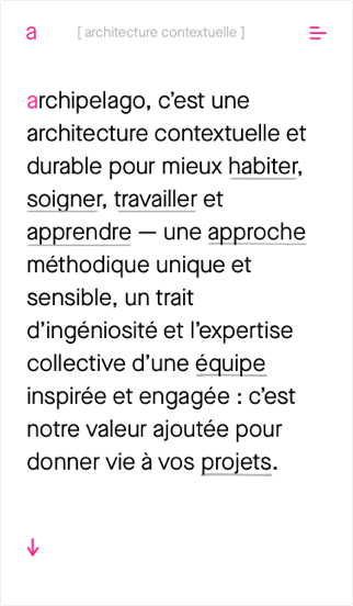
We chose text for the first screen, introducing strongly and clearly who archipelago is and what it does, playing on featured words that appeal to the visitor - and then, playfully, reveal something more behind each term. This makes the visitor want to scroll over the words to see each illustration, giving them a more poetic and inspirational understanding of archipelago’s positioning.
05 Strengthening the team and building unity
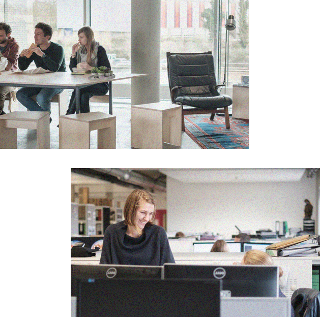
Pictures play a huge role in architecture in general; the archipelago case was no exception. But they’re usually to showcase building projects: what about the humans behind the projects? Pictures definitely would be key in bringing two different places, two different languages and work culture together.
We decided to work with a photographer (Gil) who has a documentary approach, to capture a natural, lively and dynamic representation of the people working at archipelago. Because archipelago is divided between Brussels and Leuven, the photography served a wider purpose than just illustrating work at archipelago. We needed to create a connection, a unity between the two offices to foster the archipelago brand.
Keeping a little 'Once upon a time' vibe
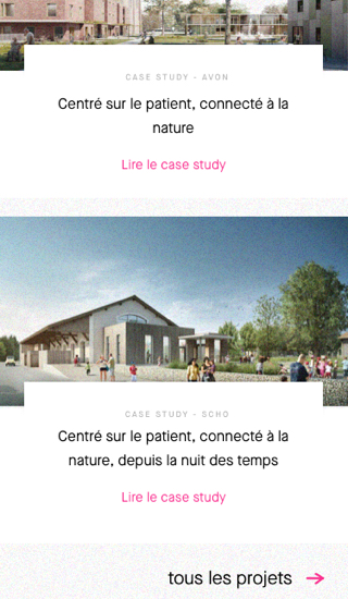
When it came to the case studies, our approach was to talk about projects not as buildings being built, but as true stories - including characters, challenges, changes, and solutions! In terms of the TOV, presenting each project as a story was echoed by using connectors between different sentences to guide the reader.
06 Going beyond
the website
We know websites don’t exist in an isolated bubble. On the contrary - they are part of a wider, richer communication ecosystem that needs to be activated to reach its full potential.
Working on a communication strategy allowed us to explore this path, giving the client specific tools and tips to make the most of all the content, visuals and texts on the website, and easily repurposed elsewhere.
