Immobel New Website
A corporate website
to live up to the ambitions
of a key European player
Our expertise
- Drupal Web development,
- Digital strategy,
- User Experience,
- Design,
- Analytics & optimization,
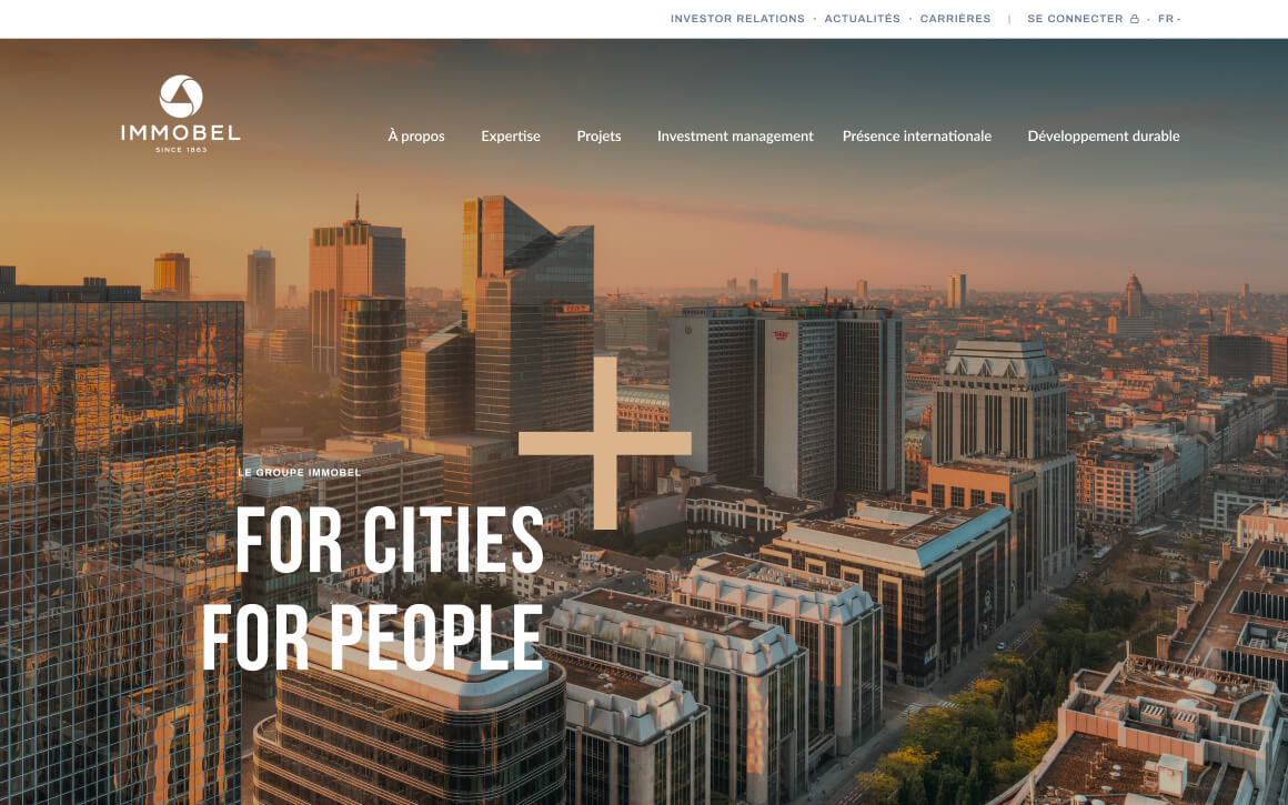
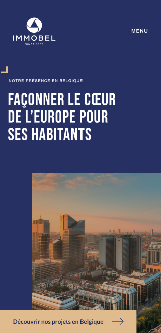
Immobel conducted an important process to refresh their brand and clarify their positioning as a key player on the European property development market. It was our job to reflect this via a new corporate website, Immobelgroup.com.
01 Discovery workshops
Our strategy workshops with the company's stakeholders allowed us to understand how Immobel masters the varying real estate ecosystems and local needs across different countries, how they are able to offer a vast range of expertise and in-house capability, and the way they face increasingly challenging environmental issues. As Belgium's largest listed real estate developer, Immobel has a good reputation on the home market. But the company's brand is not yet familiar on the other local markets.
02 Set up a strategic
digital ecosystem
The main objective for the new corporate website was to grow Immobel's reputation for a broad and international audience, and increase visibility for its projects.
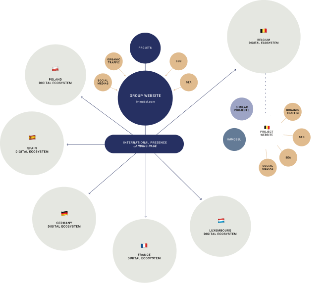
A strategic organisation of the different digital touch points
Our analysis showed that Immobel's digital assets were missing a structured ecosystem, and the data indicated that there was a major opportunity to grow the visibility of the Immobel brand and its projects with audiences that were potentially looking for projects, but did not "see" Immobel. We suggested a strategic reorganisation of the different digital touch points, serving the two goals to support and grow the Immobel brand and provide sales leads for the projects, so they mutually and reciprocally strengthened each other.
03 A smart content approach, integrating a strong SEO strategy
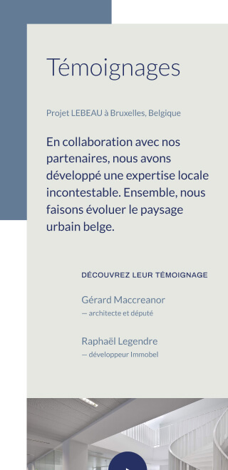
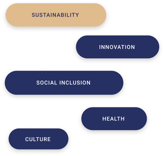
The new corporate website addresses a broad audience, with different needs and expectations. As always, the content strategy is our starting point, allowing us to define the right mix of functional and engaging content. We identified the priority themes of Immobel, and brought them alive through efficient and impactful storytelling.
Our content-first approach integrates the SEO strategy from the very beginning
Defining the required semantic context to make the website answer the audience's questions. The new corporate website aims to significantly increase the visibility of the company at different levels: Immobel as a group, with a sustainable approach and an international reach; Immobel as local business units, positioned as an alliance of international group expertise with local domain experts; and Immobel’s projects, to attract relevant customers looking for a property and its specific characteristics.
Immobel’s content strategy was built on a combination of search data and a good understanding of the different audiences. The search data allowed us to know which information users look for that is related to Immobel’s core business, and how they look for it. On top of bringing the right content and tone of voice, we made sure the website followed SEO best practices. This was crucial to increase the website’s visibility and bring the right traffic to it.

04 Build an inspiring brand universe
Immobelgroup.com is one of the main touch points for the company’s new brand identity. We pushed the boundaries of the brand’s initial guidelines to achieve a rich and versatile design system, allowing us to create a strong visual universe for Immobel’s digital flagship.
The “booster” is a key element of the new brand identity
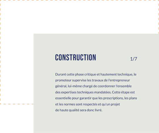
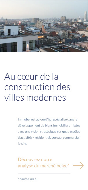
By capitalising on this strong shape and by exploring it in many different ways, we imagined an artistic direction that lives up to Immobel’s ambition as a market leader. The geometry of the design conveys Immobel’s passion for high quality architecture and the integration of nature in its projects. There was an important focus on an easy and smooth reading experience, thanks to the intelligible visual hierarchy and the use of high-contrast typography. Again, the booster’s geometric forms enhance the user experience. The attention to detail is clearly felt throughout this coherent and modern design approach.
