ORANGE.BE NEW HOMEPAGE
Rolling out the red carpet for 20% of Orange.be visitors: take a walk through the new homepage
Creating a homepage poses quite the challenge. It’s key in giving that great first impression of your brand and its identity as well as in providing all sorts of helpful information organized just so as to fulfill visitors’ expectations.
Sure, it isn’t the only way onto a website. But with the Orange.be homepage welcoming around 5.5 million visits per year, we wanted to make sure it was fit for its feature role !
01 The story
Orange is a relatively young brand on the Belgian telecom scene. After all, it was only in May 2016 that Mobistar officially transitioned into Orange. This made the homepage ideal for building brand awareness and for providing customers with an unparalleled experience. On a strategic level, we needed to convey that Orange’s days as a mobile player were over and solidify its status as a serious convergent provider. In addition to these business goals, the homepage also had to answer to an array of both current and could-be clients’ expectations.
 2016
2016 2001
2001
02 Bringing joy to efficiency
Orange promises its customers an unrivaled experience. We set out to make this clear from the homepage : bringing joy to customers all while enabling them to get things done!
Immersive brand experience
The new homepage allows customers to discover the Orange universe. In an immersive brand experience, the visitor is effortlessly guided along thanks to the organisation of information. With the visual balance and rhythm of the interface, no one will ever get bored!
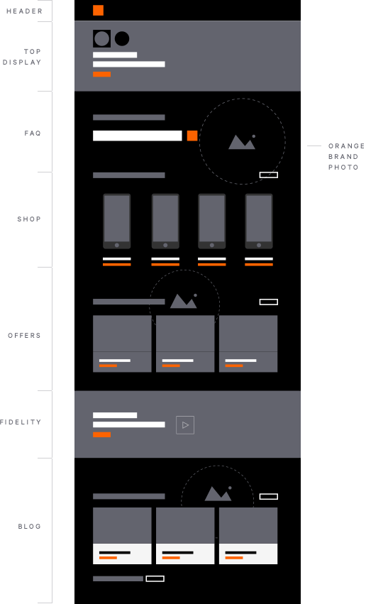
The perfect storefront for the business
We made sure to include everyone in the UX process: business stakeholders, customer support, marketing and sales teams alike were all involved in creating the new homepage in order to ensure that it serves their collective and individual business needs.
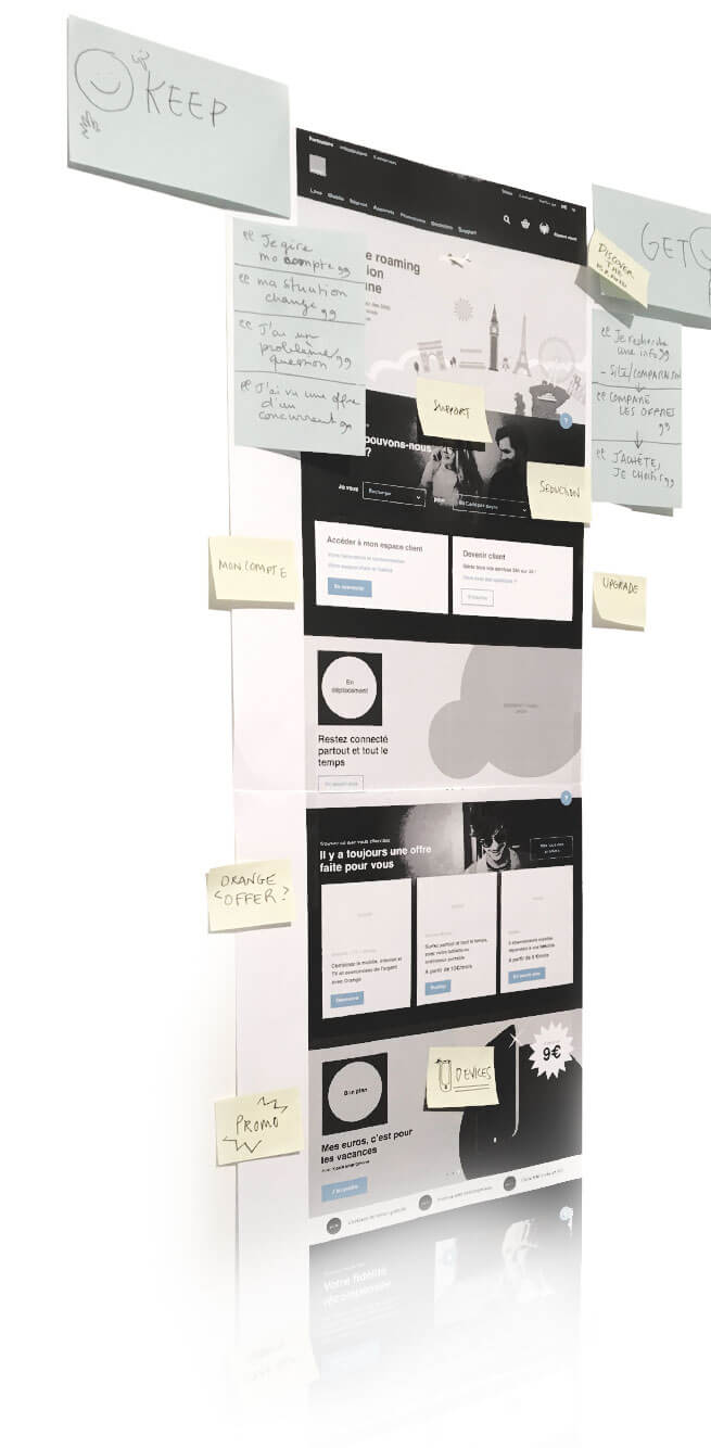
03 The right content at the right time
After immersing ourselves in the Orange community and conducting a thorough analysis of different customer journeys, we identified the exact needs that the homepage had to address. We combined storytelling with visualization to convey the right content at the right moment. Our focus, as always, was on delivering the best possible user experience.


Delivering a strong and adaptable platform
We customized every aspect of the Drupal content management system for our clients at Orange.be, so that they can conveniently create and adapt content to their campaigns. With Orange and its audience at the heart of our process, we set out to craft a flexible and reactive homepage. To this end, creating a specific homepage-centered page builder was essential.


| Sub Headline/Headline | Helvetica Bold | 40pt |
|---|---|---|
| Headline/captions | Helvetica Bold | 34pt |
| Headline/captions | Helvetica Bold | 30pt |
| Headline/captions | Helvetica Bold | 24pt |
| Headline/captions | Helvetica Bold | 20pt |
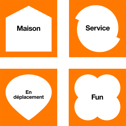
Empowering Orange through design principles made-to- measure
We set out to put in place design principles that would enhance the brand identity of the still new to the Belgian block Orange.be, making sure, of course, to address all the different constraints and guidelines. We created a design to empower and boost our clients’ brand to best reflect its nature, values and services.
04 Easy and available at any time
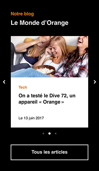
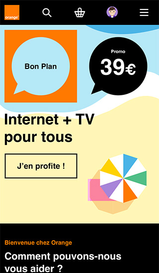
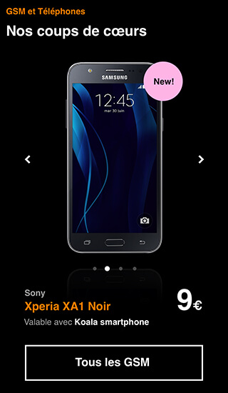
More than in any other industry, customers expect their mobile phone operator to be available on any and all devices. We made extra sure this was the case for Orange by devoting our full attention to the mobile user experience!
