swift.com WEBSITE REVAMP
Forming order out of chaos for a worldwide financial leader
Our expertise
- Content architecture,
- Storytelling,
- User Experience,
- Design
When a website already has a huge amount of content, it becomes a loop from which it seems hard to escape. The more you have, the more layers you add, and the more confusing it all gets. So, how can you actually approach the incremental transformation of a widely successful website while preserving its reach and its scope - without adding yet another extra layer? Here’s how we did it for SWIFT.com.
01 The story
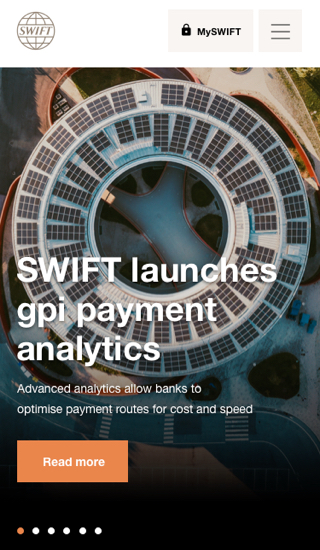
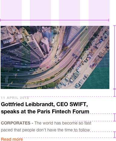
SWIFT is a worldwide company known for providing a secure, standardised network enabling financial institutions to send and receive information about financial transactions. It’s a long-lasting client relationship and we’ve already worked on a couple of projects together - but this one, given its density (more than two thousand pages!), looked like one of the most challenging!
A few important elements had to be taken into account. The design refresh had to take into account the current structure and content of the website. In addition, this project had to integrate new brand guidelines to reflect the evolution of the SWIFT brand. Last but not least, this project was motivated by technological change, as SWIFT was building a new back end in Drupal 8 to support the new look & feel.

02 Diving into a sea of information
With colossal content comes first of all... colossal analysis ! We went through the full website to identify the content hierarchy and the relationships between the different types of pages. We noticed that only a handful of templates had been used for almost all pages, meaning most pages looked the same. That makes it hard for the user to visually identify the type of page they are on or which content is important. We quickly realised that consistency was key.
So, the challenge was to identify similarities and categories to fit into a coherent and intelligible taxonomy for elements and pages.
Putting flesh on the bones
After getting this (impressive) exhaustive taxonomy of all elements and pages of the website, it was time to bring it all to life. In this flood of information, we knew what visitors were looking for. Our goal was to make it easy for them to reach their destination. To make it happen, we gathered all those elements to create smooth flows within and between easily recognised pages.
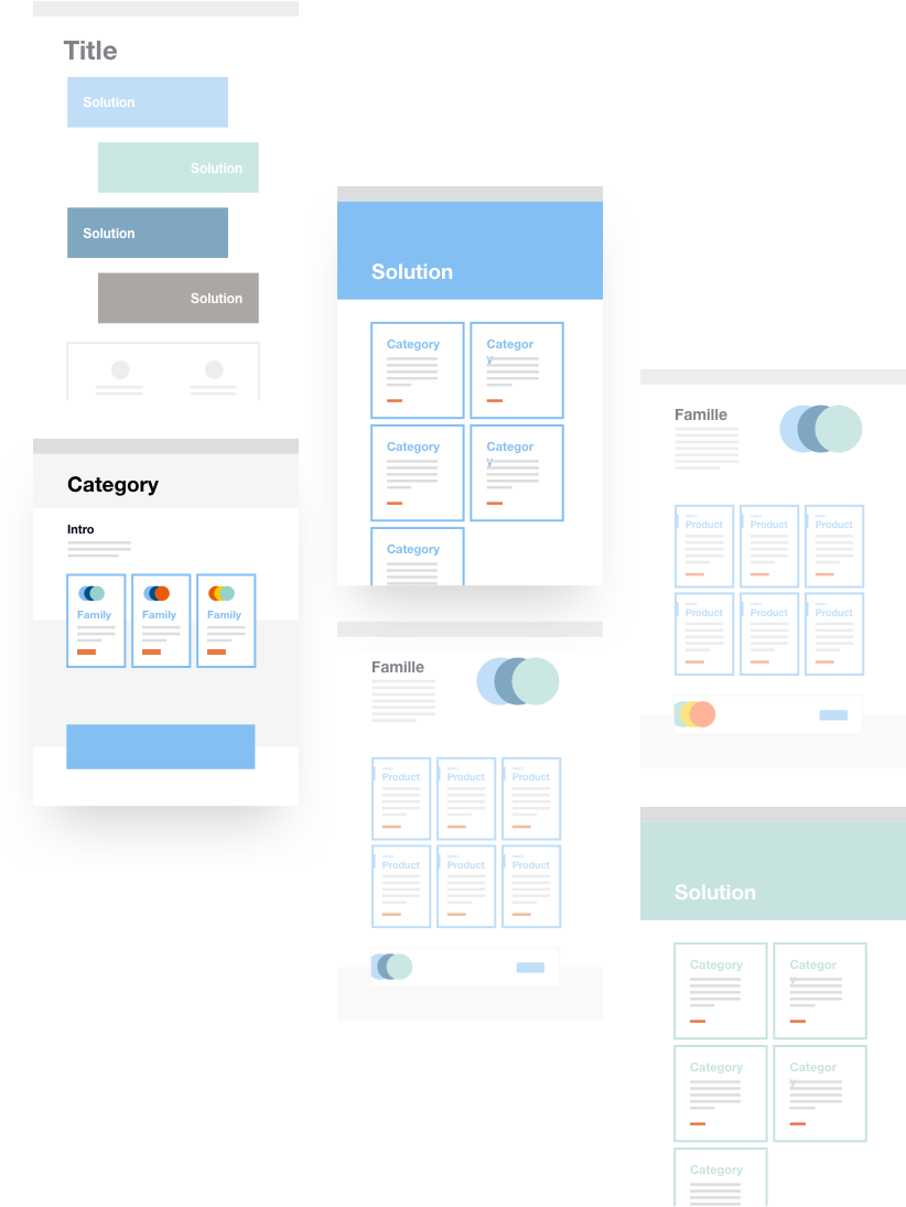
03 The start of the design system
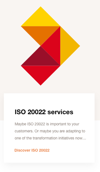
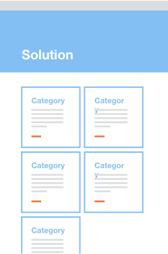
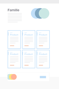
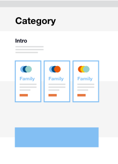
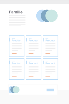
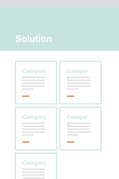
We have defined a solid and simple design system, using templates and components based on structural and content needs, as well as user insight. We also based the design system on the core content of the website, with categories like ‘Our Solutions’ and ‘Your Needs’.
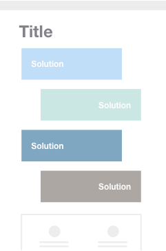
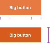
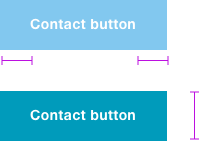
Shapes and colours
Each category has a specific colour scheme, helping visitors see where they are. Families have their own logos with colour schemes attached to their corresponding category, making it all clear and recognisable.
The design serves as the connecting point for the user - where is it, which layer? A breadcrumb isn’t enough - you need visual cues.
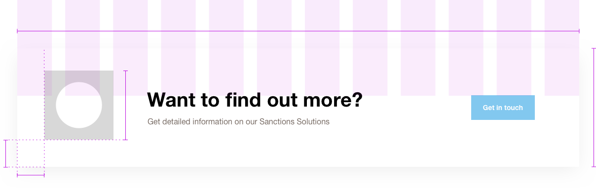
04 Building recognisable and flexible components
The guidelines form the specifications for developers, but are also a user manual to allow the client to be autonomous. As the site is constantly evolving, it is also a way to preserve the coherence of the experience and protect our design over time.
These guidelines are not only the reflection of the project's look & feel, they are also a way to understand the project and its structure in depth.

Building bridges
through stories
A bridge had to be built between our team and theirs, which meant stories had to be told. Jira and Agile methodology became our best allies in this mission. The tasks were many, the work happened in phases, and adaptations had to be made on the way. Only an organised system of task-assignment, status updates, test reports, and well written stories could keep the boat floating. And it did!

Renata Faro Digital producer
05 Passing the baton
Once the design system was built, we had to communicate it to a third party in charge of development. To make a successful design bridge with another company, we stayed involved until the very end.
At Walking Men, a position was dedicated to that mission (hello there Digital Producer Renata!), making sure the guidelines were implemented and that nothing would be lost in translation. A persistent quality assessment was put in place by Renata, in constant communication (weekly meetings are so last week) with the client and the agency.
We had to adapt to their workflow and tools and take our Jira skills to another level.
This way of working definitely took us a bit out of our comfort zone but we came out of it with stronger process management and the ability to collaborate at a wider scale.